Dawiso's New Home Page Adapts to Every Role and Team
Dawiso has a new look. But the bigger change is not the new look. The home page has been rebuilt around one idea: when you log in, you should see what matters to you and nothing else. That depends on who you are, so the home page now changes with your role, your team, and your domain.
Why the design had to change
The previous interface used white panels on a white background. It looked clean, but there was room to make it easier to find your way around.
“With everything in white, it wasn’t always clear what belonged together. We now use a grey background with white panels, so the contrast tells you at a glance how the screen is organised. We also rebuilt the way you move through the application from the home page, including the left menu, because that is what users asked us for.” - Michal Peroutka, Product Manager, Dawiso
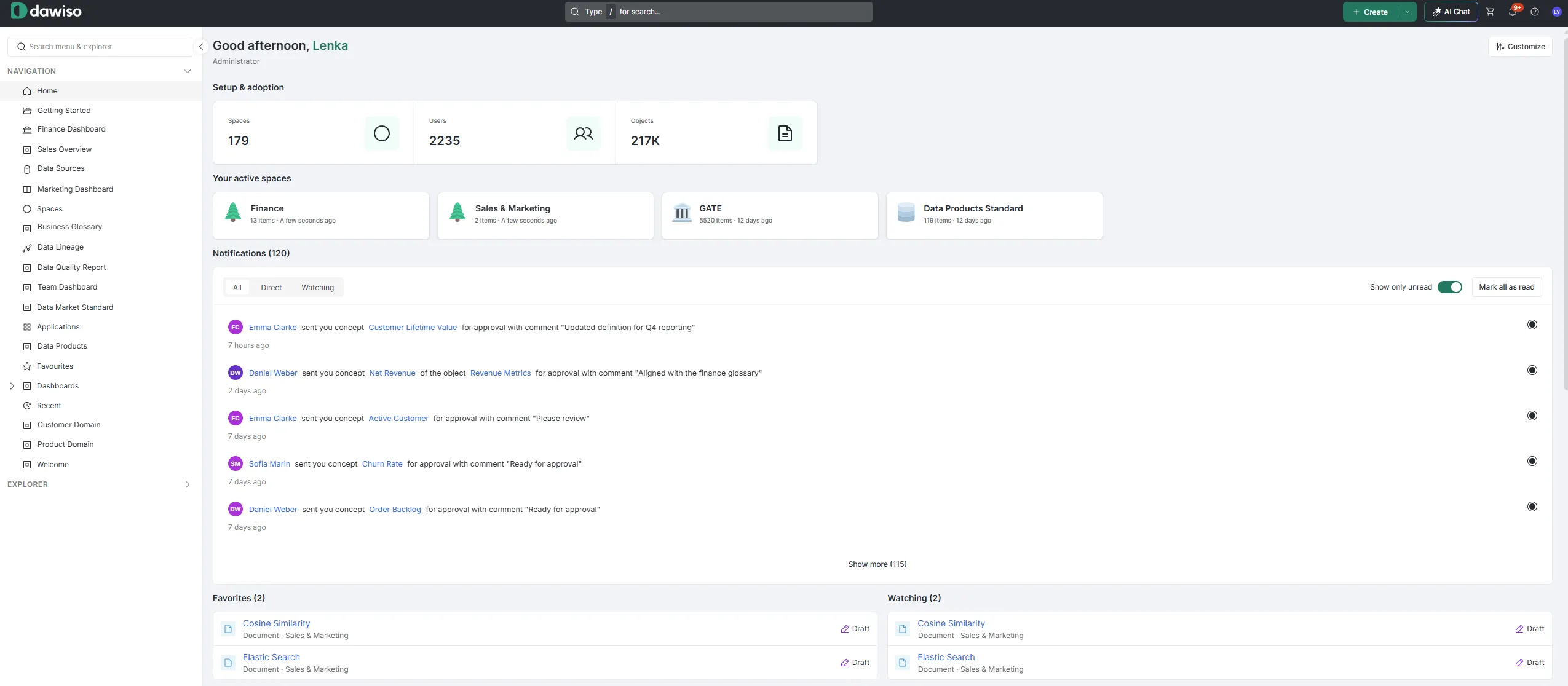
The new home page. The Customize button in the top right corner opens the layout editor.
One home page per role, not one for everyone
Admins can now build a separate home page for each application role, such as contributor, viewer, or admin, and for specific user groups. Data governance admins, stewards, and viewers can each open Dawiso to a different screen. With groups set up by domain, sales and marketing can each have their own home page with their own dashboards.
A data owner opens Dawiso and sees the objects waiting for their action, their notifications, and the objects they look up most. A viewer can land on a curated welcome page with the most relevant content already picked out for them.
“The home page now works the way people expect a modern SaaS product to work. You open it and you see what is relevant to you. We knew for a long time we wanted to build this, and now we finally had the capacity.” - Samuel Nagy, VP of Strategic Growth, Dawiso
Built by clicking, published to a team
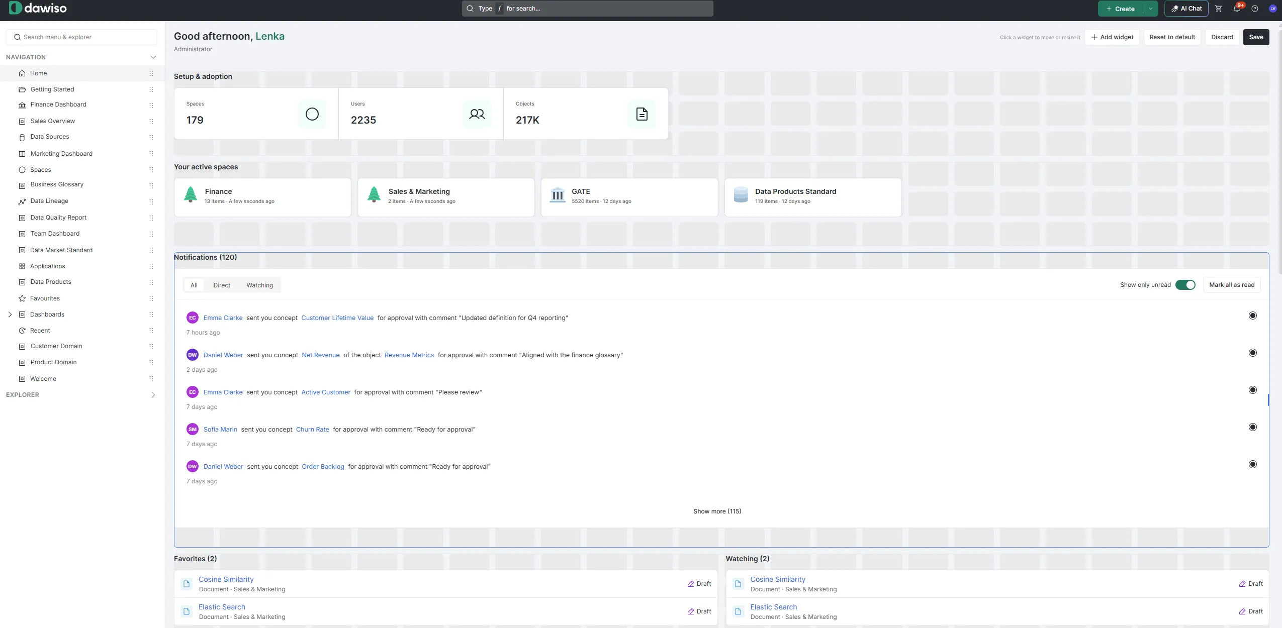
Layouts used to be set up in configuration. Now the whole home page is built in the interface. You pick widgets from a library, such as notifications, recent objects, your active spaces, or an onboarding guide that walks new users through their first steps. Then you drag them into place, resize them, and save.
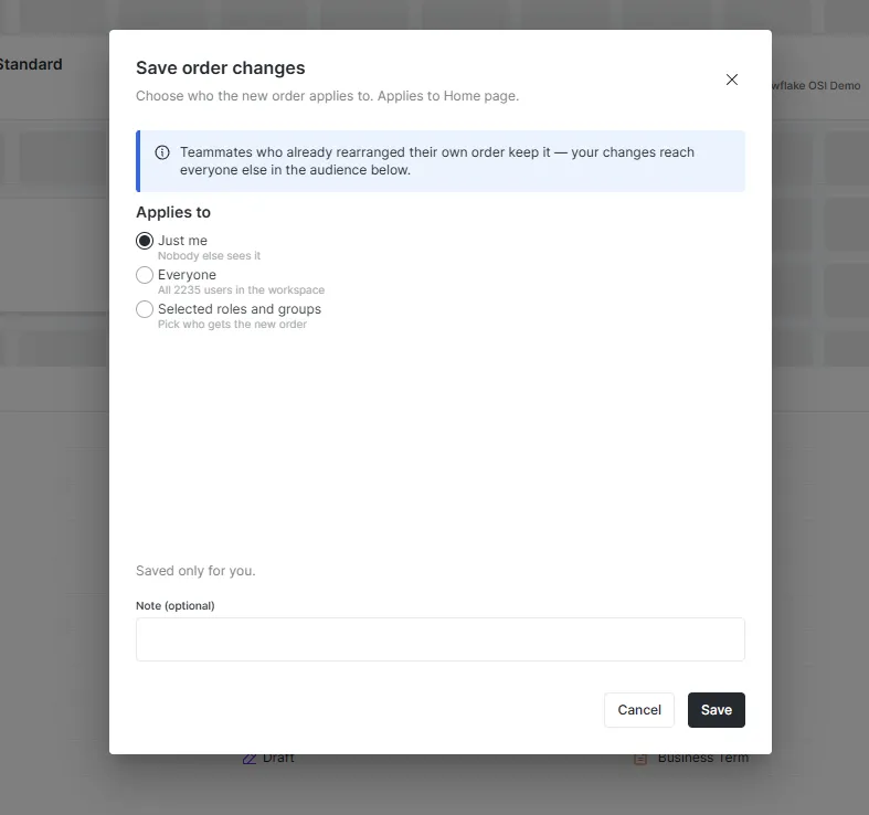
Admins choose who the new layout applies to: just themselves, everyone in the workspace, or selected roles and groups. Anyone who has already arranged their own layout keeps it.
Less clicking around, more getting things done
The new home page puts tasks first. The Pending Tasks widget collects everything that needs your action, including AI-generated attribute suggestions and concepts waiting for approval.
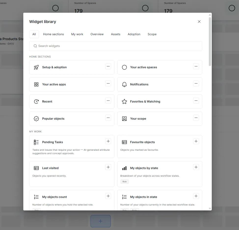
“You don’t want to click through the whole catalog. You want to go straight to the things where someone is waiting for you. It’s closer to an agentic mode of working.” - Samuel Nagy, VP of Strategic Growth, Dawiso
This also reflects a shift in how people consume metadata. Many passive users who mostly searched the catalog are moving to AI assistants such as Copilot or Claude. Dawiso meets them there with its own AI chatbot, and the search itself is now stronger thanks to LLM support.
Also new
- Tables with saved filters
- Multiple dashboards you can build by clicking
- Private dashboards shared with a smaller group of users
The redesign is part of the Dawiso 2026.3 release. Read about everything else in 2026.3 →