Collibra UX vs Dawiso: The Business-Friendly Alternative

Although Collibra introduced a UX redesign some time ago, many teams are still stuck using the older, less intuitive design. In this article, we’ll explore the details of Collibra’s current, updated interface. But the real question is: are users able to navigate Collibra as easily as in Dawiso? Let’s compare it!
Why does user-friendly UX matter in a data catalog?
Why are we even talking about Collibra’s UX? Because it’s a common source of frustration, and in many cases, a key reason why data governance tools fail to gain traction in organizations. It’s the Achilles' heel. After months, or sometimes even years, companies realize that no one is actually using the tool, because no one knows how.
Why is this a problem? Aside from the obvious issue (you’re paying a premium license fee for a tool that brings zero value), the bigger problem is that data governance cannot work unless data is truly democratized.
And you can only democratize data if you create a data-literate culture, one where every department can contribute to a cohesive and reliable data environment. Everyone, not just a select group of experts, needs to be able to contribute and access the data they need for their work.
How can you expect to build a relevant, up-to-date business glossary if the terms aren’t defined by the people who actually understand them? Who knows the right formulas for KPI calculations? Who knows what matters in day-to-day decision-making? You cannot leave the business input out of this process.
What do Collibra users say about navigation?
According to reviews on G2, many users describe Collibra as “overly complex” and “requiring expert training,” while Dawiso is often adopted without the need for dedicated onboarding sessions. One of the most commonly cited issues in Collibra implementations is poor user adoption, especially among non-technical business users.
Although Collibra is a feature-rich platform, user feedback paints a consistent picture: without intensive onboarding and training, most users struggle to understand the tool and use it effectively in their daily workflows.
As one data management consultant who worked on a Collibra rollout put it:
“Some of the language used within the Collibra tool adds a barrier to rolling it out successfully... the biggest barrier to target consumers on-site being satisfied with Collibra is navigation. Countless times I hear employees have entered the tool and it has not been intuitive enough for them to find what they want, thus they leave.”
This sentiment is echoed across G2. Many users describe the platform as “very technical and not intuitive,” with one reviewer noting:
“All people without technical knowledge have many issues at the beginning of their Collibra journey, which gives a really bad first impression. Very often, without any training, nobody in the organization is able to use the tool or understand how metadata is structured there.”
Why are these reviews so common? Even among Collibra customers we’ve spoken with, low adoption was frequently mentioned. Despite direct support from Collibra, it’s often difficult to encourage broader teams to engage with the platform or contribute actively.
Sure, databases may be scanned, but the platform itself remains underutilized. That raises questions about its usability, especially for teams beyond the technical core.
Let’s take a closer look and compare Collibra’s UX to Dawiso’s.
Collibra UX comparison with Dawiso: Data Catalog for Business Users
Compare Collibra’s new UX with Dawiso’s business-friendly design. Which data catalog offers better usability for non-technical users? We have compared 5 criteria
Step 1: Business Glossary – Collibra vs. Dawiso
The Business Glossary is one of the most critical parts of any data catalog. It's where non-technical users are expected to define, find, and work with business concepts. Let’s see how Collibra and Dawiso approach this.
Collibra: Form-heavy and fragmented
In Collibra, users are presented with a tabular list of terms by default. Clicking into any term reveals a detail page split into multiple tabs (Summary, Diagram, Responsibilities, etc.). Each tab hides part of the overall context, and users must jump between them to understand the basics of a term.
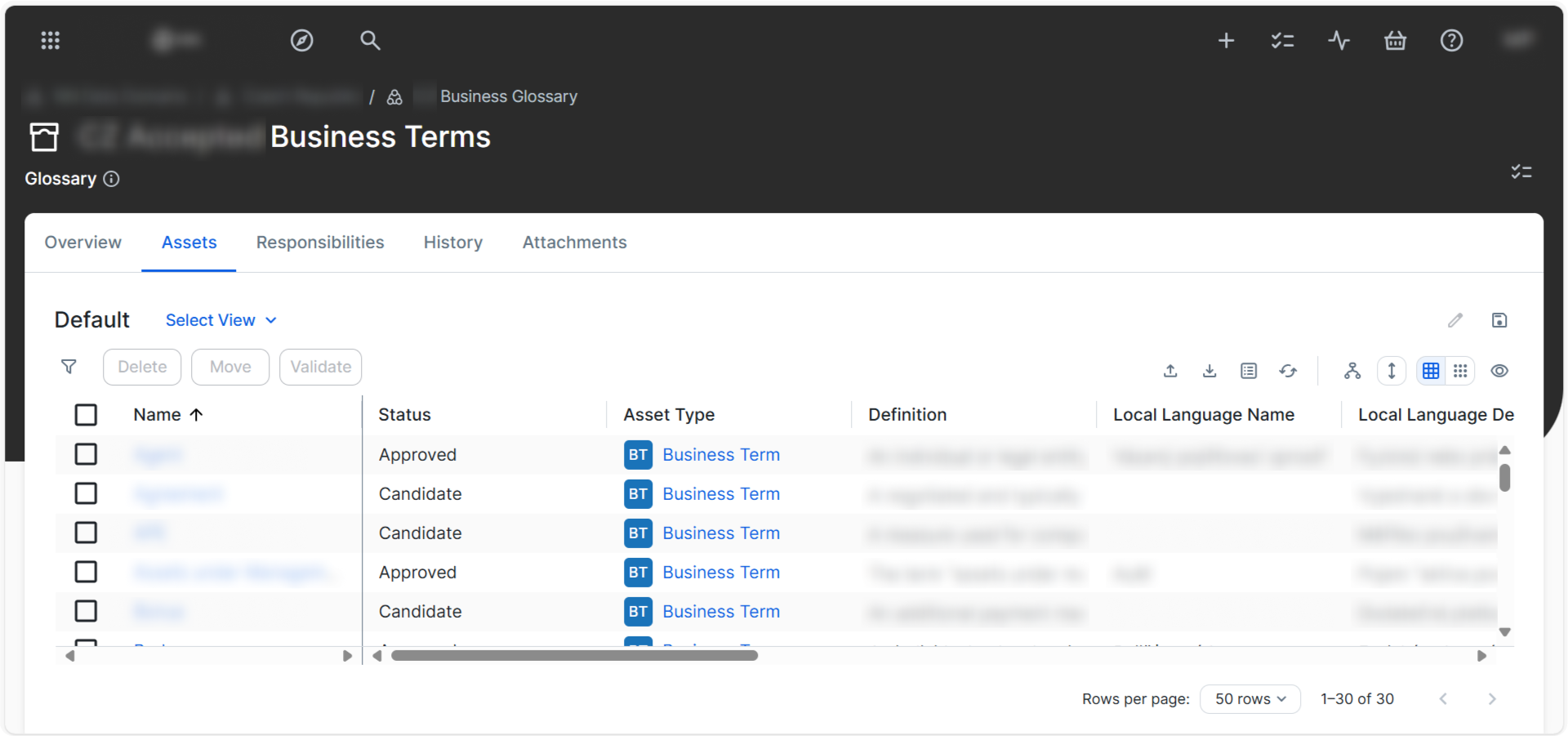
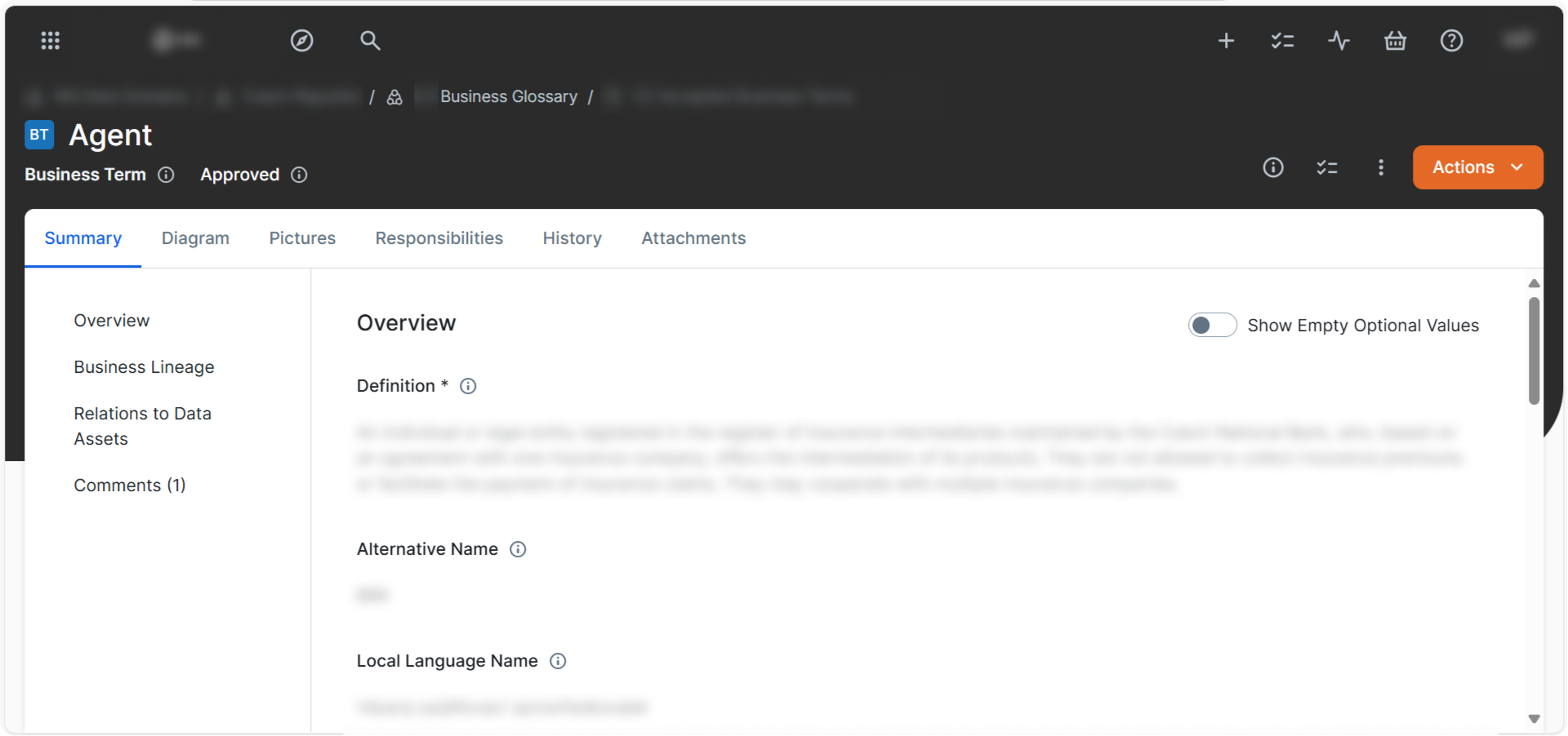
Challenges:
- The navigation feels deep and fragmented. You often need several clicks to view lineage, responsibilities, or linked terms.
- Actions are hidden behind icons or dropdowns, which can confuse users who aren’t already trained.
Dawiso: Transparent, contextual, and easy to explore
Dawiso, on the other hand, presents a fully integrated and business-first layout. The left navigation shows domains and term hierarchies clearly, making it easy to browse without needing to “search and click blindly.” When a user selects a term, all relevant information, definition, ownership, relations, and properties is visible in one scrollable panel.
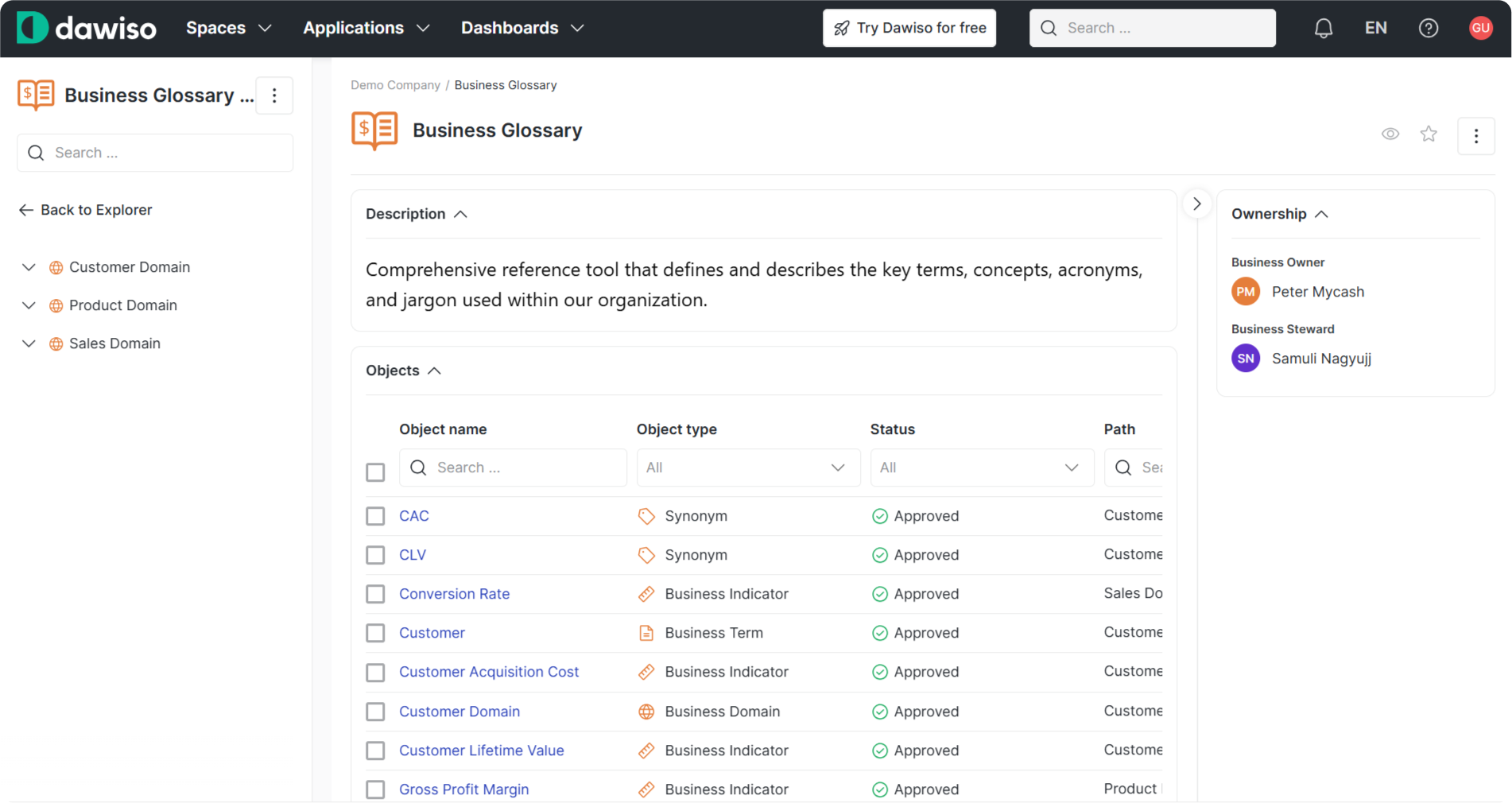
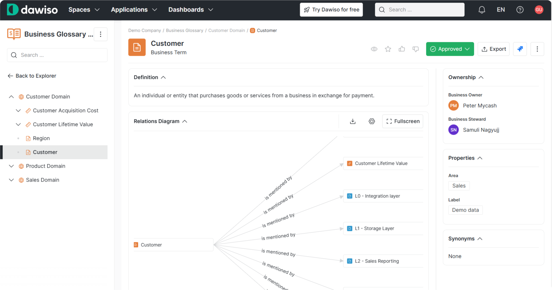
Highlights:
- Domain-based navigation provides intuitive orientation for business teams.
- The right-hand panel immediately shows business ownership and data stewards.
- Relationships and lineage are visualized directly below the definition, giving users instant insight into where a term fits within the data environment.
- The experience is linear, fast, and doesn’t require tab-hopping.
Even the filtering and search experience is simplified with dynamic controls above the term list. No need to pre-configure views or memorize what asset type stands for what.
Verdict: Dawiso makes contribution and discovery easier
While Collibra can feel like navigating an enterprise-grade form system, Dawiso’s layout mirrors how business users naturally think (by domain, term, and relationship). All relevant data is surfaced at once, not buried behind multiple views. That makes a huge difference when you want the glossary to be more than documentation, to actually become a living tool that users update and rely on.
Step 2: Filtering – Collibra vs. Dawiso
Filtering is a core function in any data catalog. Whether you're a business user looking for a specific report or a data steward browsing asset types, filtering should be simple, intuitive, and flexible. Here's how Collibra and Dawiso compare.
Collibra: Detailed but Clunky
Collibra’s filtering options offer a wide range of metadata attributes, from asset types to statuses and specializations. The structure is powerful but feels disconnected from the overall interface.
What stands out:
- Multiple pop-up windows: The filter experience opens in a separate box that overlays the interface. This can be disorienting, especially if you’re still getting familiar with the platform.
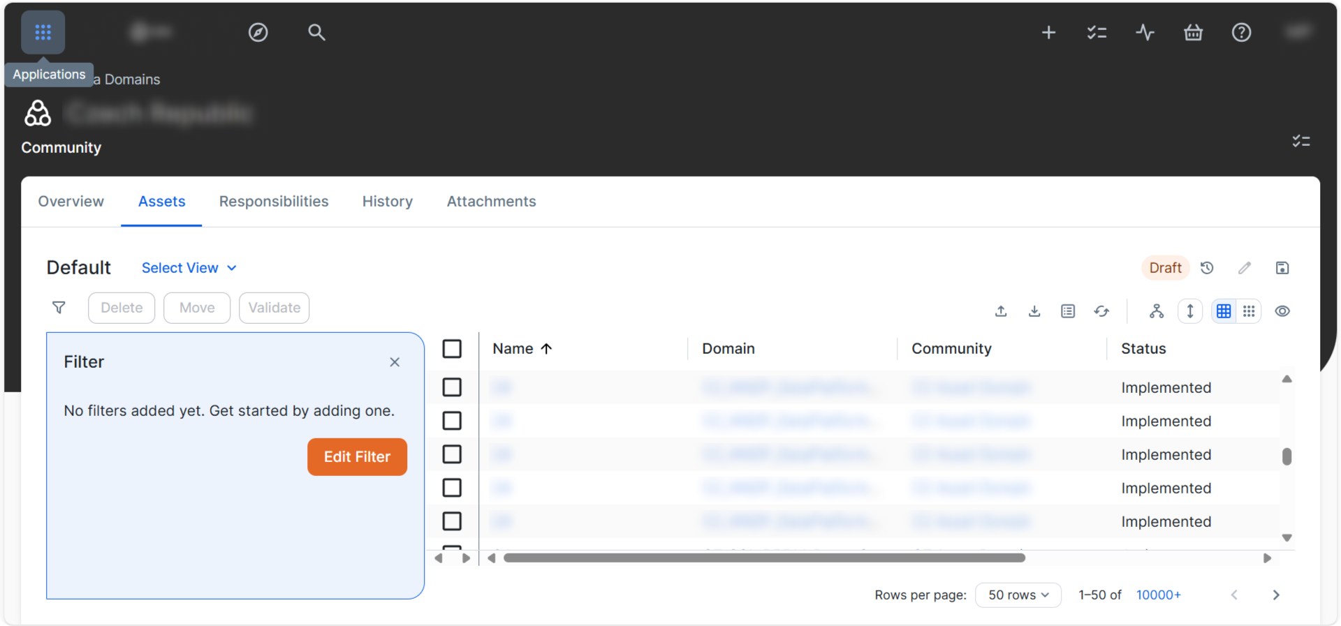
- Dropdown inside dropdown: Adding filters requires selecting a metadata type (e.g., BI Report) and then defining a value, all while staying inside a small modal box.
- Overwhelming for new users: There are many clickable areas with little guidance, and some filters (like “Include specializations”) feel cryptic without documentation.
In short, the filtering is comprehensive, but built more for trained data experts than everyday users. Even applying a single filter takes several clicks and screen overlays.
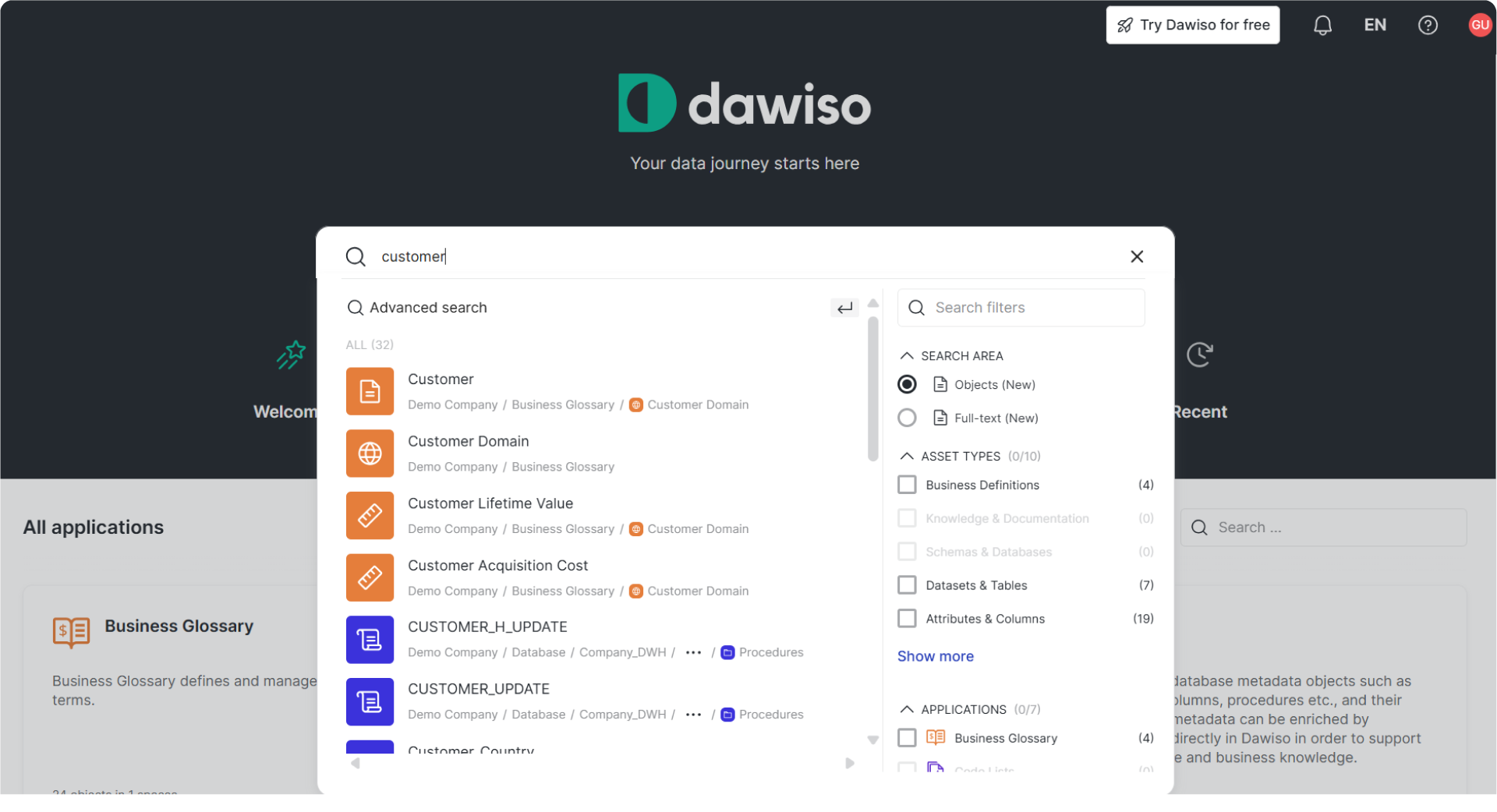
Dawiso: Seamless, search-first, and user-friendly
Dawiso flips the model entirely by starting from search. You begin by typing a term or keyword, and filtering becomes a natural next step, not a complex configuration task.
Key strengths:
- Unified search + filter: Users get instant results as they type, and filters are available in a clean sidebar, no extra pop-ups, no surprises.
- Smart filtering options: You can quickly narrow down by object type (e.g., Tables, KPIs), application (e.g., Business Glossary, Code Lists), or even explore domains.
- Modern, intuitive UX: Instead of hiding filters behind layers, Dawiso surfaces them as a natural part of the search journey. The system feels like it understands how users search, especially if they’re not technical.
Verdict: Dawiso makes filtering feel like Google, not like configuring a database
While Collibra treats filtering like a mini-engine in itself, with its own UX logic, Dawiso integrates it into the main experience. Business users can start with a simple query and then refine with ease.
Step 3: Data Lineage – Collibra vs. Dawiso
Understanding where data comes from and where it goes is at the heart of trust and transparency. But that only works if users can actually see and follow the lineage. Here's what happens when we compare the experience of exploring data lineage in Collibra versus Dawiso.
Collibra: Technical detail, limited usability
In Collibra, the lineage diagram does exist, but it feels more like a raw technical rendering than a true exploratory tool. The user is presented with a wide horizontal diagram filled with dataset boxes and arrows, but navigation is tricky, and context is thin.
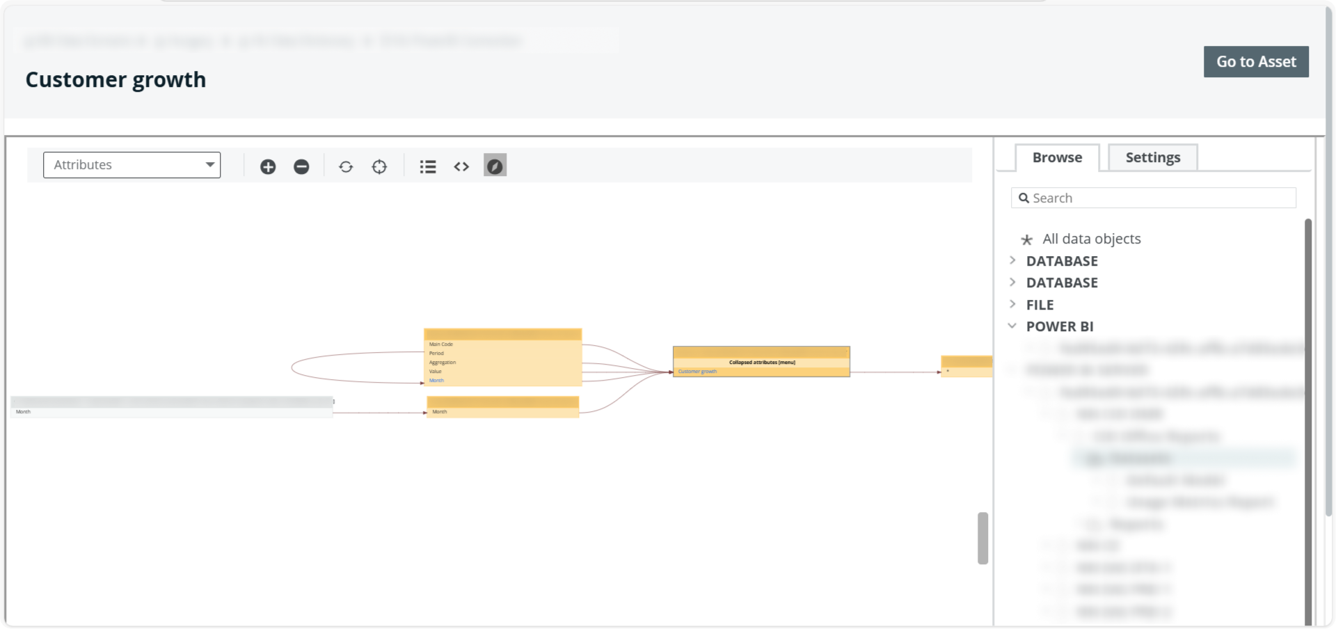
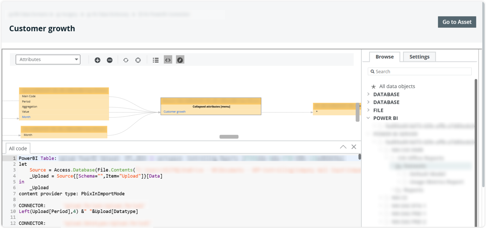
Key limitations:
- Linear, narrow context: Even though the nodes connect, you're stuck in a horizontal scroll without clear grouping or business-readable names.
- No clear entry point: Clicking on nodes doesn’t provide additional information or actions. You don’t know what each asset is without hovering or inspecting deeply.
- Limited interaction: The sidebar on the right allows object browsing, but it’s detached from the visualization, there’s no contextual view, and you can't use it to jump directly into a term or report with full metadata.
In some cases, the only way to go deeper is to exit the diagram and manually search for the related asset, breaking the exploration flow entirely.
Dawiso: Visual-first, clickable, and deeply connected
Dawiso takes a completely different approach. Instead of technical sprawl, the diagram is hierarchical, clean, and interactive. Each lineage node is not just a box, it’s a live entry point to more information.
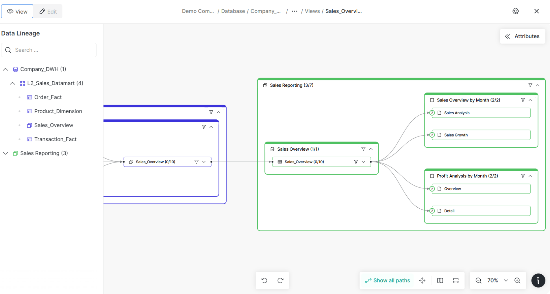
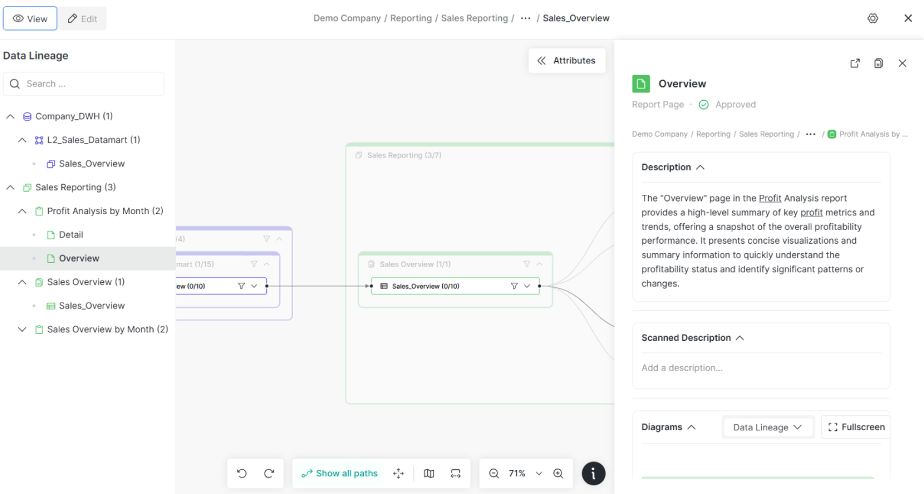
Highlights:
- Integrated right panel: Clicking any node brings up the full metadata, including descriptions, scanned lineage, and relationships, right inside the diagram.
- Group-based layout: Nodes are visually grouped by domain or layer (e.g., Company DWH, Reporting), making it easier to understand context at a glance.
- Path exploration: Users can click “Show all paths” or focus on specific ones. Even non-technical users can follow data from a report all the way back to the warehouse layer.
- Everything connected: From the lineage, you can jump into business definitions, source tables, or KPIs, all without leaving the screen.
Dawiso turns lineage into a two-way street: not just something you view, but something you use. Whether you're a data engineer checking report inputs or a finance lead tracing a number’s origin, the diagram adapts to your role.
Verdict: Dawiso turns lineage into a navigation tool. Collibra stops at a picture.
In Collibra, lineage feels static, like a visual export of metadata. In Dawiso, it becomes a living interface that ties together reports, KPIs, terms, and databases. You don’t just “see” your data’s path; you move through it, understand it, and act on it.
This difference is what makes Dawiso usable not just by data architects, but by analysts, auditors, and business leaders alike.
Conclusion
Both Collibra and Dawiso deliver robust data catalog capabilities, but the user experience tells a different story. While Collibra offers powerful features, it often leans toward complexity, making adoption harder for non-technical users. Dawiso, on the other hand, emphasizes clarity, context, and simplicity. Its business-first UX makes metadata exploration intuitive, even for users without technical backgrounds.
From glossary navigation to lineage diagrams and report catalogs, Dawiso consistently presents information in a way that supports everyday decision-making. For organizations looking to foster real data democratization, not just implement a tool, Dawiso offers a modern, approachable alternative that doesn’t compromise on depth or control.